Monday, December 22, 2008

Don't get too close

I was tinkering with the picture of trees, adjusting some details. I made a copy of the whole thing and then zoomed into part of it, to see how some of the layers were working. This is something I often do when fine-tuning a fractal image: work with greatly enlarged copies to try and get the colors to work better. It's always disappointing when I make a large print-sized render and discover that there are weird orange blobs or grey halos or something appearing in places which were formerly sub-pixel specks.

At any rate, after I'd gotten my gradients all tweaked into place, I decided I liked the zoomed version of the image enough to make it into its own thing. Though obviously based on the same elements, it's a contrast in many ways to the parent image; instead of being settled and serene, with an expanse of dark sky, it's focused on the frenetic commercial center of the holiday season. Things blink and spin and explode. It has a kind of relentless energy, like the Muzak that fills the stores and the insistently cheery well-wishers who won't leave you alone. Buy! Smile! Feel that Hallmark-approved glow! Buy some more! It resembles an advertisement gone wrong, and in the dizzy confusion all you can do is try to dodge the shards of mirrored glass as they orbit past.

Consumer Incentives


A useful reminder to myself, perhaps, that it's not a great idea to look too closely at the holidays. Better to admire the glitter from a distance, and try to hang onto whatever serenity is available.

Sunday, December 21, 2008

Longest night

Happy Solstice!

Yule Trees


Tent Julia formula, festively decorated with excessive goop.

Saturday, December 20, 2008

Reasons to stay inside

My semester is finally over (hooray!) and so I have a little time to think about fractals again. I expect it will take me a while to get back up to speed again.

This weekend we're getting a whole bunch of unusually wintery weather, so I dug up a very old image that I've always liked, but that somehow never made it as far as any of my various gallery pages.

Snowbound


When I first made this one, in early 2001, I remember being annoyed by how slowly it rendered. That was at least two processors ago, and now it takes less than a minute for a decent screen preview, and about twelve minutes for a 1600x1200 disk render, which seems much better.

Tuesday, September 30, 2008

Beats two pairs

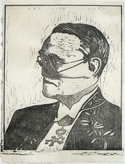
My current project is a woodblock printed over a series of inkjet-printed fractals. The woodcut is a portrait of Gaston Julia, adapted from the couple of pictures I was able to find online.

Gaston Julia
Gaston Julia

Sosaku-hanga woodblock print using sumi ink on kitakata paper, 8" x 10". Artist's proof.

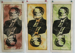
The fractals are Julia sets, of course, and I've been experimenting with how to best take advantage of their natural symmetry. The end result is a little bit like a playing card.

Three Julias
Three Pairs of Julia

Sosaku-hanga woodblock prints using sumi ink over digital inkjet prints on kitakata paper, 9" x 20.5" each.

I still have some more fractals I need to render and print. I suppose I'll eventually end up with enough slightly creepy copies of Gaston to wallpaper a room or something.

Friday, September 26, 2008

Heat & light

Sometimes I miss Pittsburgh, in spite of everything. It had some really nice old industrial buildings. So did Providence, for that matter. Lately I've been wondering if maybe I should move back to the eastern half of the continent once I finish school, but then I remember how miserable the climate is there during about two-thirds of the year.

Still, decaying urban squalor has its appeal.

Foundry


The formula is Newton-ish and embossed. That's all I remember without re-opening the parameters.

Friday, September 19, 2008

Fewmets: put 'em in the blender

Ugh, school is completely kicking my ass. I do have some fractal-related projects in the works, but it's going to be several weeks, probably, before any of them are far enough along to be worth looking at.

I've been trying to keep up with the digital end of things in a small way, by following the challenges posted to the Ultra Fractal mailing list. On my second go-round with Challenge #2, I was thinking about school, and about the people I was spending time with in my very first couple of semesters. One of the long-term effects of that association is that now I get very angry and upset when I come across any references to dragons, particularly in a fantasy-novel or comic book or role-playing game kind of thing. (Fortunately, I never had all that much interest in those particular entertainments. Still, it's an annoying sort of neurosis to have.)

This image is therefore dedicated to —— and —— and their drawings of cute goo-eyed dragons. Thanks for the lingering bitterness, you jerks.

Dragon Pureé


Man oh man, I sure do get cranky and irritable when I'm in school.

Friday, September 5, 2008

Am I awake? Now what?

From the Institute of Druidic Technology, an early mousepad with fractal decoration. I think this one needs to go in the same category as that Mandelbrot Monk guy.

I'm back at school as of this week, and already miserably stressed out about what I'm going to do this year. I'm a senior now, so this is the big push to make something really impressive for my BFA show. Obviously, there should be at least some component that is fractal, but the difficult part is figuring out how to integrate that into the rest of the stuff I'm doing. It bothers me that there still is such a large division between the fractal-making part of my life and the serious-schoolwork part. I kind of just want to haul some of my fractal prints in to printmaking class and say, "See? This is what I've really been doing all this time. What would be the best way to frame them?"

I'm still chicken to do it. I suppose I still expect art people to be unable to take fractals seriously, which is silly of me, because they've been taking me seriously during all my smeary paper-litho experiments, and all my painstaking woodcuts. (But still, I say to myself, they took those seriously because of being lithography and woodcut, not because of the fractals! Grr, stupid useless self-doubt.)

The other stressful component of school, of course, is having to wake up much earlier than I would really like to. I only actually have one really early day a week, so I suppose it won't be so bad. And it's true that the sky is lovely during these fall mornings, the air cool and pleasant.

Urban Sunrise


Barnsley formulas, for architectural squareness, plus some gnarl and spiral traps, to break up the straight lines a bit.

Friday, August 29, 2008

Quartz is the most common mineral in the crust

I just got home from a brief vacation in Montana, where I got to do a bit of hiking and admire the spectacular scenery and also dig in the ground in search of quartz crystals. I love the geometry of crystals, and I especially like the ones that are interestingly distorted or flawed.

There's always a sort of jarring transition when I've been out looking at natural phenomena for a while, and then look at fractals, and the fractals all of a sudden seem much too simple and perfect, and I despair of ever making anything that looks half as cool as the stuff that's outside. Over the years, I've tried to make fractal clouds, and fractal spectra, and fractal plants, and none of them is ever as good as the real kind. But they are, I suppose, interesting in their own way, and so I persist.

One of the kinds of crystals that can happen is called a scepter. (Some more nice scepter pictures here.) I only found one small example of this shape while I was digging, and sadly it was full of internal fractures, so much so that it started to break apart while I attempted to brush sand off it. But the name made me think of a silly pun, so I came home and made a picture to go with it. So, from the mountains of Montana, and the Scepter Valley of the Mandelbrot set:

Amethyst Scepter

Tuesday, August 19, 2008

De-Rezzed

Hooray, I've got my gallery pages into enough shape that I think they'll do for a bit. I'm hoping to get some more stuff added before I go back to school, but at least there's something there now.

This morning I was thinking about how to make pictures that looked like they'd been Photoshop-filtered, but could be rendered at high resolution, for printing. I did some experiments, and was going to post about them here, but it turned into quite a long-winded thing with a lot of pictures, so I made a separate page for it. So now the world can read all about my filter forgery.

I started with this fractal:

A New Era


And mangled it half a dozen different ways. Are any of them any better than the original? I have no idea; I've been staring at them all for way too long, and have lost all sense of aesthetic judgment. I do think it's kind of entertaining that typing up my notes on the process seems to have taken at least twice as long as it took to make the experiments in the first place.

Monday, August 11, 2008

Return to an unfamiliar place

I started my Oz series in the unhappy July of 2004, and finished (theoretically) the final image just about a year later. There were seven illustrations, to which I attached quotes from the book, although the slippers were ruby, referencing the movie. I did two major versions of the Emerald City, and was never happy with either of them: the first was too fluid, and looked more like a pile of seaweed draped over a rock than like buildings. The second was in some ways an improvement, but went too far in the other direction, and looked too right-angled and geometric.

Today, I was supposed to be working on something else entirely, and realized that the shapes I was looking at were much more the right kind of thing. So I tried making them green. I don't know if this will be the final version, but I like it better than the first two.

Emerald City (2008)


Architecture by Antoni Gaudi, clouds by Maxfield Parrish, formulas by all the lovely authors of .ufm and .ucl files. Whatever remains (after all those bits are subtracted out) is entirely my fault.

I'm getting close to being finished with the re-design of my actual gallery pages, so maybe I'll put up the Oz series again. It's hard to decide what goes into the real collection; I've gotten used to just sticking things on this blog, without much regard to technical merit or thematic consistency.

Sunday, August 3, 2008

It would have worked with a glass spring

I've just been re-reading Terry Pratchett's Thief of Time, so I suppose it was inevitable that I would make a picture based on this passage:

The glass clock ticked. It stood in the middle of the workshop's wooden floor, giving off a silvery light. . . Within the transparent case red and blue lights twinkled like stars. The air smelled of acid.

Now his point of view dived into the thing, the crystalline thing, plunging down through the layers of glass and quartz. They rose past him, their smoothness becoming walls hundreds of miles high, and still he fell between slabs that were becoming rough, grainy. . .

. . .full of holes. The blue and red lights were here too, pouring past him.

The Glass Clock of Bad Schüschein


This has, among other things, four layers of gears, three layers making up the bright spectrum lines (which mostly look white at small sizes), and two layers for the red and blue lights. The red and blue dots are arranged in hypocycloid and epicycloid patterns, respectively, each with three hundred and sixty dots making twelve loops. Just to be even more obsessively mathematical about it than I already am. (Possibly it should have been 365 dots, to make a year. I could try that, and re-render it. It would mean the spirograph patterns would lose their symmetry, but that might in fact be an advantage.)

There's a lot of messy detail in this one; it's arguably too busy. It looks lousy in this small version, okay at screen-size, and would probably be pretty good printed.

Wednesday, July 30, 2008

Purely decorative

A less complicated image, after all my manic mangling of gears:

untitled [golden rosette]


This uses the same Jim Muth formula as the Candied Fireball. The rosettes are the inside of the fractal; they remind me a little bit of certain kinds of neo-classical wall decorations, molded in low-relief plaster and then gilded or picked out in multiple colors of paint.

Tuesday, July 29, 2008

More gears

After this, I really should put the gears away for a bit, and try something else for a change. But I couldn't pass up the overlapping stacked-up effect on this one.

Aleph-17 Jewel Movement


The jewels don't show very well on a screen-sized render, but at print resolution they're very shiny and detailed: an excellent example of detail at many scales.

[jewel detail]


Can fractals be steampunk? I suppose they're quite anachronistic, but then so are robots. So they probably can.

Monday, July 28, 2008

Clockwork orange brown

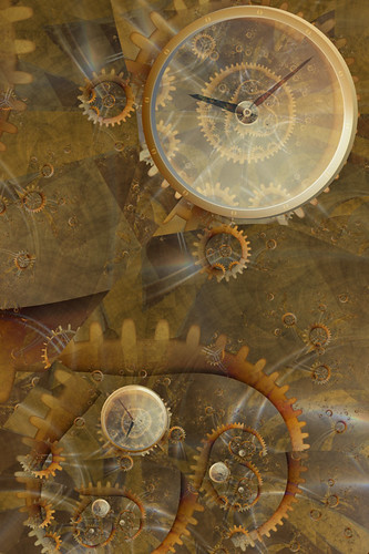
Here's the more complicated image I was working on yesterday. I messed with it a bunch today, as well, and I think maybe now it's done.

Keeping Time

Keeping Time

I'm all pleased with myself, because I've figured out how to make the gear shapes using a single layer of orbit traps, instead of two layers. The teeth used to be one, and the center ring or disc used to be another, but now I've got them all crammed into one unit. This isn't even anything to do with UF5; I could have been doing it in UF3, but until now I hadn't learned how the Multiple Traps thing works. Now I've given it a concerted effort, and I know more than I did. It's somewhat fiddly, but it makes the coloring of the gears a lot easier, and avoids certain annoying discontinuities.

Sunday, July 27, 2008

Manybranchia eyeglassus

This is an odd and rather simple image which was an offshoot of a more complicated thing I spent most of the day working on. It puts me in mind of Edward Lear, not the limericks, but his lovely strange short stories and poems about cats and Clangle-Wangles and the Yonghy-Bonghy-Bo.

The Monocle Tree

Friday, July 25, 2008

Good bones

A little while ago, I had a strange dream in which the Fractal of the Day was gone. I don't know why this was so significant, because I hadn't looked at the FotD in a number of years, but in the dream I was very sad about it. So I went and looked, and there it was, just the same as I remembered. Since then I've been checking it occasionally, and going back through some of the older images. They are soothing in their simplicity: single layer GIFs, no anti-aliasing, and with a certain emphasis on (or at least interest in) mathematical explorations instead of aesthetic ones. At the bottom of each page, there's a set of parameters you can copy and paste into Fractint, if you want to generate the image yourself, for further exploration.

And then I remembered that Ultra Fractal has a fair amount of compatibility with Fractint, so I copied and pasted Elephant Ring. And found myself looking at a rather fascinating unknown formula, almost completely stripped of the smooth slickness I'm used to seeing. To take it even further, I removed the color as well, and had a look at the barest bones of the fractal.

I was reminded that any image starts with the most basic elements of composition: points of focus, lines or curves of emphasis, repetition of shapes, all the stuff that seemed so boring when we were freshmen. But you can't build an effective image without being aware of these underlying structures. This formula has nice ones.

untitled [dividebrot5 skeleton]


Here, the black points are inside the set, and the white points are not. As simple as that.

Pretty soon, though, I was done with minimalism, and started putting layers back on. All the good bits are still there, under the surface, making the finished picture possible. I may have gone a bit too far with lush, multicolored, excessive goop. Maximalism?

Candied Fireball


So, a big thank you to Jim Muth, for the DivideBrot5 formula, and for continuing to produce the Fractal of the Day.

Monday, July 21, 2008

Playing

The cute fuzzy cats go all surreal and melty when you stick them in a fractal.

A Meditation on the Nightmares of Goldfish

I still can't decide whether image importing is just inherently cheesy, or if there might be circumstances in which it would become acceptable. And on the other hand, it's quite easy to make cheesy terrible things without importing any images at all.
8-bit
8-bit

The pre-processing of the cat and fish was done in Photoshop. The video game fractal gives a tip of the hat to Wikipedia for providing me with a screenshot of the original Pac-Man, but all the parts of it were made using various orbit trap colorings, which means I could (in theory) render it enormously large without any loss of image quality. Not that I can think of any reason I'd want to.

Friday, July 18, 2008

Morphology

Hooray, I'm all properly registered now, and messing with the image importing feature. I used a picture of a pretty butterfly, just because I'm in that kind of mood. And because I didn't have a picture of a fluffy kitten handy.

untitled [morpho swarm]


The base for this one is a phoenix formula. The imported butterfly image is quite large, such that I could probably render the fractal big enough to do a decent print. With this remarkable ease of image inclusion, it seems like one major implication is that the possibilities for all sorts of illustration are dauntingly vast. The fractal can become something much more like collage, with enormous potential for surrealism even beyond the already dreamlike quality of the algorithms themselves. The main thing, I suppose, is that now it's very easy to include literal recognizable content. The fractal is no longer a pure abstraction, but can be crammed full of symbolism and allusion and who knows what all.

So beyond knowing about how to assemble the fractal layers into the effect I want, now I need to think about what outside elements to include. It might mean taking photographs, Photoshopping them in various ways, getting them ready for their eventual placement. I could think of it as pre-processing.

I am...intimidated. I thought I didn't know where to start, but now I've started and I don't know which direction to go next.

Saturday, July 12, 2008

New toys

I downloaded the evaluation version of Ultra Fractal 5 a couple of days ago. Man, I really wanted to not like it. I was all set to look at the latest upgrades and improvements, and say "Bah, I don't need any of these flashy new bells and whistles! I tried importing images a couple of times and could never get them to look properly integrated with the rest of the fractal." I was suspicious of the changes to how the coloring algorithms worked. I've been quite happy with UF4, and I could have just kept using it, but of course I was curious, so I thought I'd give the new version a couple of days of testing, to see how bad the learning curve would be.

And then, to my combined dismay and delight, it rocked.

The new separation of, say, general Orbit Traps method and actual trap shape makes the whole thing much more flexible. I love that you can copy and paste just parts of the coloring, to transfer them from one layer to another. I especially love that you can copy and paste attributes to multiple layers at a time; I used to do a lot of exploring where I'd get a number of layers in a good combination, and then decide I wanted to see what that combination looked like on a different Julia set, and have to copy and paste the Julia seed (or even a whole different formula) one layer at a time. It was slow and tedious, and now it's a simple couple of clicks.
I'm still kind of meh about the whole image importing business. The way it works now is really slick, and so I imagine I might spend more time in the future dropping in different images, to see if any of them worked better than my past experiments, but I suspect it's just not my style. My favorite bit of tinkering so far is very silly indeed: I was thinking about the question of importing an image with sufficient resolution to do a large print render, and it occurred to me that extreme low-resolution might be an interesting option instead.
Navigating the Internet


This uses, er, some Barnsley formula or other, with the new and improved orbit traps. The anti-aliasing is generally lousy, because this is a crummy resized screenshot instead of a proper render. I get to agonize now about whether I can manage to afford to register the wretched program and be able to do renders again, or if I should just go back to UF4 for now. Grr, stupid moving expenses. Stupid unexpected car repairs. Maybe next month; I should be a little less broke by then.

Wednesday, July 2, 2008

Purple prose

Bah, I'm ashamed of myself for continuing to read the Complaints Department. Somehow I can never tear myself away for very long. And once in a while it does inspire me to write something silly, so maybe it's not completely terrible.

. . . . . . . . . . .

A fictional conversation, late 1850s.

Woe! Woe! Misery & woe!

What? What's wrong?

A new color has just been invented. It's the first-ever synthetic organic dye.

So, what's wrong with that?

It's mauve! It's an inherently tacky and hideous shade of purple. Now all the talentless amateur hacks will be able to paint pictures with no redeeming artistic value whatsoever. It is the End of the World! Woe!

Wait, are these the same talentless hacks you've been complaining about for the last several years? The ones who are cranking out kitsch at such an alarming rate that your deep and meaningful art never has a chance of getting any critical notice?

Yeah, those same ones.

So why is having a new color any different than using the same old colors?

Because now the hacks have it EASIER! Instead of having to use a paintbrush to make their horrible travesties, they can just dunk the canvas straight into dye, and call it done!

Huh. Well, okay, I guess. But why does it matter so much what the hobbyists are doing? It seems to bring them some joy, and it's not like it needs to affect your important, well-thought-out art in any significant way, does it?

What! Of course it affects my art! You see, they're calling their appalling junk art, so how in the world can anyone be expected to tell the difference? I mean, they're both called the same thing, and there's so much of their bad art out there that most people are going to think that's what it's supposed to be like. Then when people see my good art, they think it's stupid and wrong. Oh my, people say such terrible things about my art. They tell me it's ugly. They say it looks like it was made by a talentless amateur hack. Woe!

Wow, that really sucks. Have these art-defying amateurs always made bad kitsch, even though you've been carefully pointing out what's wrong with it all these years?

Yeah, there's no stopping them. They don't seem to listen to me at all.

And yet you keep trying.

Well, I feel it's important. Somebody has to speak up about these things. Silence implies agreement, after all. It's a public duty, at the very least, for a few brave, clear-sighted individuals to bring these injustices to light.

So you continue to repeat, over and over again, that their aesthetic sense is non-existent, their efforts are inadequate and laughable, their standards are faulty, and their respected institutions are riddled with corruption, is that it?

That's pretty much it, yes.

But somehow, none of them seem to like you very much.

No.

I just don't understand it at all.

They're just wrong, that's all. Misguided and wrong.

Well, that's all the time we have. Thanks for chatting. Goodnight!

Woe!

Armageddon in Mauve


(The preceding image was constructed without the use of false devices. Persons claiming to be our representatives are swindlers. No soap 'til Thursday.)

Sunday, June 22, 2008

None for you

I'm in the middle of moving into a new apartment right now, and today I took a break and looked at some various fractals online, by way of a distraction. A bit of orderly chaos, as a change from the disorderly chaos of boxes around me.

I should have realized, though, that it would only make me all frustrated, because of course looking at fractals makes me want to go exploring, and make pictures of my own, but the computer with all the fractal-rendering programs isn't available right now, and isn't going to be available for another several days at least. Arrgh.

Instead, I've dug through the folders on my (faithful, old, slow) laptop, and found this one, which seemed somewhat appropriate.

Temptation


It's related to several of the ones I've posted in the last weeks. Those spirals are down there, all right, curling slowly in the smoky beam of the spotlight. But I can't have them right now. Grr.

Wednesday, June 11, 2008

I have spoken.

Another look at the jewel-encrusted walls. This time I tried for a really battered and time-stained effect on the background. The gems themselves, being of course made of some adamantine and superior Barsoomian material, retain their flawless and scintillating lustre, though it has been uncounted thousands of years since the deft hands of long-dead craftsmen set them into place.

untitled [wall series]


These all started with the interestingly-named Burning Ship fractal. In the past, I have found its reflective symmetry somewhat too much, but it seems about right for these decorative motifs.

Friday, June 6, 2008

These primitive tools

This one is somewhat related to the previous couple, but ended up brighter. I could probably have given it a nice cheerful, sunny title, but I'm still in Intrepid Explorer mode, so it's called

Bronze Axes


(There are two axes, the real axis and the imaginary axis. Ha ha. I'm an idiot.)

Wednesday, June 4, 2008

Hooray for Captain Spaulding

Just when I think I'm completely jaded and done with fractals, things come along and give me another nudge. I was looking at the ever-reliable Fractal Complaints Department, and although there's never actually anything new there, it did remind me that it's been a while since I made any brightly-colored, excessively-layered spirals. So tonight I spent a little time exploring.

Into the Jungle


While wandering through these shadowy (though remarkably well-charted) regions, I found myself surrounded on all sides by the usual sorts of creatures: things with spines and scales and multicolored warts and, of course, lots of spirals.

Pathological Monsters


These two are both Mandelbrot zooms, with similar locations and many of the same coloring algorithms applied. I have a few others saved; maybe at some point I'll post more and call it a series.

Friday, May 30, 2008

Impractical wall coverings

This is an idea I've been tinkering with for some time, but have never gotten quite right. It's inspired by one of the descriptions of an impressive piece of palace architecture, in typically overblown Barsoomian style, from The Chessmen of Mars by Edgar Rice Burroughs.

The stones were carried down the walls in an irregular fringe for a few feet, where they appeared to hang like a beautiful and gorgeous drapery... In that single room was a vast treasure equal to the wealth of many a large city.


This isn't at all a literal illustration of the passage (although that might be worth trying too, at some point) but I think I've made some progress with the ridiculous-numbers-of-jewels-set-into-the-wall effect.


Maybe I need to try something with some natural symmetry. One of these days I will dig through my folders of formulas, and find one with a nice repeating tangent function or something, that will give me a series of arch shapes.

Saturday, May 10, 2008

Digital to analog conversion

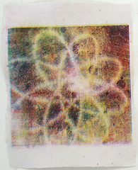
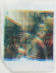
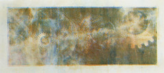
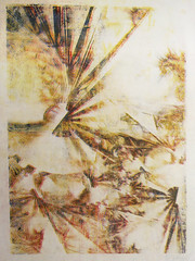
In the latter half of the semester in printmaking, I've been experimenting with a process similar to lithography, which uses simple photocopies as its source material. This means that I can use fractals, and either render individual layers, or do color separation in Photoshop, and then print them in several colors. My initial attempts were just as garish and psychedelic as all the old-school fractals I've been carefully trying not to emulate all these years, but I was able to moderate that a bit by not using straight cyan, magenta, and yellow for the ink colors.

The process is by its nature not very exact, and prone to all sorts of random noise and distortions. But I'm finding the results interesting enough that I think I will try to work with it some more in the fall.

Paper Litho #1
Paper lithography #1

Paper Litho #2
Paper lithography #2

Paper Litho #3
Paper lithography #3

Paper Litho #4
Paper lithography #4

Thursday, March 27, 2008

Probably nicer inside

This one's pretty bleak. I can't decide if it's depressing, or if it just makes me want to eat chowder.

untitled [dismal view]

Wednesday, March 26, 2008

Peering out through murk (or in?)

I suppose this is a continuation of my series of windows. Although on closer examination, these may actually turn out to be some other sort of optical device.

untitled [fractured portholes]

Monday, February 18, 2008

Also stripes

An experiment with color and lighting. The base formula is a Nova Julia, and I'm finding it difficult; it's hard to decide where to focus, and all the compositions I've tried seem either unbalanced or cluttered or both. There's sort of a vanishing point thing happening in this one, which is maybe okay.

untitled [sepia sawtooth]

Sunday, February 17, 2008

A pair of portraits

I think I've been tinkering with these two images, off and on, since September. I'm still not quite sure if they're done yet, but they're definitely getting close.

Mr. Edison


Mr. Tesla


Both use the ploom formula as a base, and both have similar coloring methods applied.

Saturday, February 16, 2008

Another window

Another window. I like how cold the light is in this one.

untitled [airscape 2]

Sunday, February 10, 2008

Craving light

A window to look out of, with nicer light outside than there is out any of the real windows I've been near lately. I'm impatient for spring to happen.

Making fractal landscapes is harder than I might have expected. I've been trying to stick to just fractal formulas, and not use things like mapping-onto-a-plane, so the trick is to find an area with vaguely horizontal shapes, and then try to color it in such a way that there's a clear dividing line between land and sky.

untitled [airscape]


The window is a variation of something originally done (I think) by Gilles Nadeau.

Thursday, February 7, 2008

More input

I'm all uninspired and blah lately. I think what I probably need is something new, something outside my usual tiny orbit of school and home and the occasional grocery run. I will have to think about what kinds of sensory information would be interesting or useful.

Ear, Nose & Throat


A visit to the conservatory, to see if some greenery might be available at this grey time of year? Some new music to listen to? Chocolate?

Thursday, January 24, 2008

Shut up and eat yer hot dog

Well, hey. It's the cold & bitter end of January, Valentine's Day is coming up, and actually I'm feeling a bit better in some directions. So I will post this one, and then stop thinking about boring many-years-old crap.

View from a Broken Heart


This one's from some time ago, and I can't remember which base formula I used, but there's a whole bunch of Orbit Traps and a certain amount of fiddly color masking.

Friday, January 18, 2008

Where do I go from here?

A new semester has started, and I'm wishing I knew what direction to go. Now is when I need to be thinking about themes and ideas and imagery, and I'm feeling awfully blank. I wish I had a compass and a map, or a set of handy directions.

untitled [navigational instruments]

Wednesday, January 2, 2008

Also probably influenced by JMW Turner

One of my worst difficulties with fractals is that they've become inextricably connected with a person who traumatized me very badly a couple of years ago. It was great at first—I'd met somebody who really liked the images I was making, and who seemed to connect with them in exactly the way I'd hoped my audiences would. Suddenly I had a muse of my very own, and for at least a year I was amazingly productive. We had all sorts of plans for putting together a portfolio of my work, and taking it around to art galleries to see if they might be interested in the stuff.

Then it all went bad, as so many promising partnerships seem to do. I found out I'd been betrayed, lied to, and generally used. I didn't touch a fractal program for a long time after that, and when I tentatively tried to go back to my old familiar pixel-pushing, I found that the spark had almost entirely died. I probably have a few of those pathetic parameters saved, buried in a hard drive where hopefully no one will bring them to light.

In some ways I've gone on with my life. In other ways I haven't really been able to. I'm still not sure which category the fractals fall into; it would be nice to think that the fractals aren't permanently connected to the pieces of my psyche that got broken then.

So, if I have a New Year's resolution, I suppose it's to keep on keeping on, to try and pursue the images when I'm able, and to remind myself that there was a time before those painful connections were even made, that I loved the patterns of chaos purely for themselves.

Polychroma Trainwreck


The book we made as a portfolio may still exist, for all I know. If it had been in my keeping, I would have destroyed it, but I don't think the circumstances were nearly so unpleasant from the other side's point of view. So it's possible that it's still out there somewhere.