Monday, August 31, 2009

Out of character, out of time, out of cheese error

Wow, I can't believe it's the end of August already. That means I've survived NaArMaMo! I did manage to make something nearly every day, and I posted something every day, even if the thing I posted wasn't necessarily the thing I made. I will therefore confer upon myself the Award of Reasonable Successfulness.

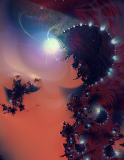
As a final end-of-August outburst, I'm posting another limerick and its accompanying fractal. I have to say, the picture really never worked quite right until I added the neon stars.

When out on the town acting girly,
Fair Julia sometimes grows surly,
And I strongly suppose
The chief cause of her woe's
That her beaux always bail out too early.

Party Girl


On the principle that all art is to a certain extent self-portraiture, I begin to worry a bit about my character, morals, habits, and color sense. Maybe I'm just feeling over-exuberant because I'm done with my enforced month of art.

Now I think I'm probably going to give myself a short break from art-making. But I'm actually quite happy to have had a reason to get back into the habit of writing regularly; I don't think I've been such a dedicated blogger in years. I should try to keep it up, if I can.

Sunday, August 30, 2009

Go faster!

I've done some further investigation of yesterday's excruciatingly slow fractal, and discovered that in setting it to render larger, it had indeed gone into arbitrary precision, which accounts for some of the slowness. I also figured out that I could switch to the associated Julia set and get an almost identical effect without having to zoom so deeply. So I've got a different version rendering now, and it says it has a mere three hours to go. Hooray!

Some tinkering with a nearby Mandelbrot region, and some nice quick simple orbit trap coloring, has given me an idea for a possible label design. I'm not sure about the color. It seems somewhat too dark.

Saturday, August 29, 2009

Somewhat less than one pixel per second

I remember when I got my first computer, and I downloaded Fractint and would sit and watch as it rendered images, one slow line at a time. And I remember my early days of using Ultra Fractal, when new coloring methods would be written, some of them were ridiculously complicated and would render one slow line at a time.

Over the years, technology has advanced, processors have gotten faster, and I can open up some of those old parameters and have them appear in a few quick seconds. But somehow, I always still seem to end up staring at my monitor, transfixed, as an image appears one slow pixel at a time. Sometimes it's because I'm doing deep zooms, that get into arbitrary precision. Sometimes it's lots of layers. Sometimes it's ever-more elaborate coloring methods.

This tiny snippet is probably the slowest combination of things I've tried so far. It's a Mandelbrot zoom, with Extended Precision, fairly close to the boundary (so needing lots of iterations to avoid blank gaps), and with my own parametric coloring in a particularly slow configuration. At 400 x 400 pixels, this took four hours to render. I wanted to do a test of whether it would look like I expected, so as to be used in a larger, several-layered image. Unrendered, it dissolves into a mass of crunchy pixels.


So now I'm wondering, is it worth doing the somewhat larger render of the image that this is a component of? It looks like the guilloche-pattern effect is working the way it's supposed to. If I go by my on-screen working version, the colors and layers are okay. Render time estimate is somewhere between 850 and 900 hours. That's more than a month, assuming it doesn't slow down a lot when it gets near the minibrot in the middle.

Well, I've started it. It can mutter away in the background while I'm thinking of other things.

Friday, August 28, 2009

Hey, where did the texture go?

I suppose I have to give NaArMaMo some credit for kicking me in directions that are somewhat different than usual. I'm not necessarily convinced they're good directions, but it's interesting to see what falls out of my brain after I'm way past being out of ideas. This one is basically the result of me pushing the 'pretty' button* over and over and over until something happened.

untitled [hex-star-chain]


There's something about it that reminds me vaguely of anime. It's partly the color, I think, and partly that some of the shapes look like puffy cartoon clouds.

. . . . . . . . . . .

* This only comes with the super-secret hax0red version of the program, of course.

Thursday, August 27, 2009

I don't know if I mean disco or Dante's

There's not much excuse for this one, but I made it today and so up it goes. Isn't August over yet? I don't know how people survive the novel-writing thing in November.

Julia Inferno

Wednesday, August 26, 2009

In which art-making grinds to a halt

Portfolio still needs work.
Label still needs work.
Help file for coloring method still needs work.
Spent all day in semi-comatose state. Art is basically not happening today.

However, the UF mailing list has unexpectedly broken out in fractal humor, which is exactly like you'd expect: it's funny only to an infinitesimally small segment of the population, and arguably not even funny to them. It gives me an excuse, though, to post limericks. So here is one.
A volatile fractal geometer
Saw an insect, and hurled a small bomb at her:
"The chaotic effect
Of that butterfly wrecked
My picnic, and broke my barometer!"

And an old fractal, by way of illustration. This one's from early 2003.

Monarch

Tuesday, August 25, 2009

Too much like last time

Current problem: I want to make a label for my binder-portfolio-thing, so that I will have something to put in the complicated window. Six years ago, I made such a label, and I'm finding that the process of making a new one has me all horribly tied in knots. I wasn't expecting that. I thought most of the old bad stuff had been adequately dealt with, but evidently it hasn't.

So I've been all stuck, and finally decided to see if I still had the parameters for the old label. They should have gotten the full napalm treatment, but no, they're still moldering away in some of my archives. And now that I've rendered them again, they look a little flat. A little dull. Some of that, I remember, was fixed by a suitable application of typography, but the colors are more monochrome than I might like.


At least that solves the problem of wondering whether I should just re-use the thing as it is. It would definitely need some tweaking. And I think maybe I will scrap my more recent attempts, because they look too similar, and try to figure out some different approach entirely.

Monday, August 24, 2009

Petroleum by-products

Arrgh, I'm up to my elbows in a project that has reminded me of all the reasons why I don't like bookbinding very much. This thing (if I ever get it finished) is in some senses nothing more than an oversized, glorified, three-ring binder. But I'm covering it in iridescent bookcloth, and giving it a small business-card-sized window on the front, which is incredibly slow and fiddly to construct.

According to my plan, if it all works out right, this will become a portfolio for the transportation and display of fractal prints. Hooray. But at the moment, I'm hating the stupid thing.

In between changing my exacto blade and picking glue off my fingers, I'm continuing to tinker with the hypocycloids. This particular experiment ended up looking somehow toxic and ominous. Because of that, and because it's fairly closely related to my recent money-ish image, I'm calling it

Big Oil

Sunday, August 23, 2009

More self-promotion

I'm back to working on a couple of real-world projects, so I don't have a new fractal to post. Instead, here is a link to a page that may or may not become the new splash page on my website.

morgan bell
digital & analog artist


Even if I don't use it for that, I'm happy to have made the silly thing. It makes me laugh. Also, it makes me wonder if it might be fun to use the a and the E to design a logo.

Saturday, August 22, 2009

Time to build the Identity Crisis Booth

Today I read two articles on the New York Times website, one a complaint about some art being unsuitable for children, the other a description of a work of (performance?) art in which coffee was given away. Between the two articles, I've been reminded of a whole bunch of things in the current state of the art world that make me unhappy enough to deny that I am an artist at all. Really, I wish there was some better word to describe what it it I am, and what it is I do, because "art" doesn't seem to have anything much to do with it.

First, there is the kind of art that is supposed to be shocking. It isn't, anymore, but people keep making the stuff and insisting that it challenges people. As far as I can tell, the only challenge involved is trying to find something to say about it other than "Bah, another one about bodily fluids." If there is still any shock value to be had, it's limited to unsuspecting parents suddenly realizing that their afternoon's outing with the kids is going to involve a lot more explanation (and teachable moments—ugh, what a horrible phrase) than they had planned.

The difficulty with this over-saturation in shock art is that eventually it reaches a stage where if you're making something that isn't pornographic, or woven out of your dead grandfather's armpit hair, or saturated in your own menstrual blood, no one is willing to admit that it might be art. It will be dismissed as mere decoration, pretty-making, inconsequential, something to hang over the couch. It isn't art; it doesn't count. I really hate that particular aspect, mainly because it means it's hard for me to be taken seriously (hey, my stuff's often pretty!), but also because it's incredibly narrow and limited. It means there's not much out there that I want to look at, or be curious about, or be inspired by.

The coffee thing is much simpler to explain, I think. If people can't tell whether a thing is supposed to be art or not, and if when they're told it is art, they only become more confused, that work of art has failed. Yeah, there are artists out there who will say that the point of their art is to produce bafflement and to make people question their entire view of the world, and their place in it, and art's relation to them, and blah blah blah. As far as I can tell, that kind of art mainly produces irritation rather than insight, and as such, is completely full of shit.

Maybe I should write a manifesto.

Anyway, the image I'm posting today is only tangentially related to all this. Mainly it was an exercise in applying some of yesterday's shapes to an actual fractal. Arguably, it's also related to my recent letterpress License to Print Money.

Economic Debacle or Hardly Currency

Friday, August 21, 2009

Technical interlude

I accidentally made a useful discovery about this parametric-curves coloring method I've been working on. It's nearly done, and I've been working on writing a help file, but of course mostly I just spend time playing with it.

Originally, it made dotted shapes, like these.


Then just recently, I had some help, and got it to do joined lines, as well.


It turns out, if you type the wrong thing in certain parameters, it can also do things like this.


Click on the pictures for bigger versions, especially the last batch—they look really cool when you can see all the fine lines.

And then all these can be mapped onto fractals, exactly like any other orbit trap. Those last complicated ones become fairly slow to calculate, but no worse than some of the other coloring methods out there. I have a number of potential-images-in-progress using some of this stuff. They're fiddly to work with, because their geometry is extremely non-fractal, and so it's easy to end up with a kind of awful jarring mismatch of styles. But I think I'm starting to find ways of integrating them into compositions with reasonably good effect.

Thursday, August 20, 2009

Am I still here?

Carrying on regardless, and trying to remind myself that there are always possibilities. Even if some of those possibilities aren't quite what I was hoping for.

(The World is) Your Questionable Mollusc

Wednesday, August 19, 2009

Through the meat-grinder & onto the scrap-heap

Last night I dreamed about my first visit to Seattle. The weather was stunningly wonderful, all flawless blue skies and painfully brilliant sunlight and impossibly clear air. That was several years ago, now: probably the last time in my life I was ever purely, perfectly happy.

The weather was like that again today; it hurt my eyes to look at it, and hurt the rest of me to remember. I'm hitting a point of saturation and disgust, with fractals, with myself. I'm not sure whether I'll be able to keep doing this post-a-day for much longer.

untitled [to hell with pretty spirals]

Tuesday, August 18, 2009

Pretty flowers

Something suitable for late summer:

Queen Anne's Lace

Monday, August 17, 2009

Some kind of force-field

Today was a day of tentative experiments, frustrating dead-ends, mysterious errors, and general malaise. Nothing I've done is in any condition to be shown to the world. So instead, I'm posting another of my weird-old-sci-fi images.

untitled [suspension]

Sunday, August 16, 2009

A long title for a long picture

I finally got all my printed-out panels mounted to foamcore and stuck to the wall, via a precarious arrangement of magnets. A number of them got dinged up during the process of figuring out how to get them to stick properly, but this isn't a huge problem because I've been thinking of this installation more or less as a maquette.

It would be fun to use the large-format printer to make an even bigger version, mounted on wood or something reasonably permanent, instead of foamcore. Of course, then I'd have to figure out yet another different system of attachment, since the magnets wouldn't hold the additional weight. So it goes.

A Medieval Conception of the History & Development of the Cosmos


Twelve panels, inkjet print on photo paper, 8 inches high by 10 feet long.

I seem to be making a theme of these long, narrow, hallway-running printed things. There was that scrolling map thing I made in my sophomore year, and the tangram sequence at my BFA show, and now this silly fractal. I suppose they all have a sort of vague narrative-sequence effect, which means they're somewhat related to my interest in books. The fractal, if read from left to right, ends with a minibrot.

The photograph doesn't show it very well, of course, so here's a link to a digital version, 500 pixels high and 7500 wide.

Saturday, August 15, 2009

Nickel-iron, stony-iron

Man, I totally missed the meteor shower. It was cloudy here. I like meteor showers, both as an astronomical phenomenon and a sort of metaphor: periodically we cross paths with something that fills the sky with sparkly interestingness. Sometimes life is full of more than the usual amount of extraneous particles, which can be pretty and make us go "Ooh, ahh!" or occasionally be big enough to hit something and really put it out of whack.

Lately, I've been feeling like I could do with a bit more sparkly and a bit less reduction-to-smoldering-heaps.

Meteoroids

Friday, August 14, 2009

Stripped Bare By Her Bachelor's Degree, Even

I've spent way too much time this evening reading about Marcel Duchamp, and trying to write down some of my own ideas about the things he did and why they're important. It's bizarre; it feels like I'm writing another paper for art history, and I'm having to grapple with some of my own lingering difficulties with school and with the art world in general.

Duchamp is one of those legendary people I've admired for as long as I can remember. I don't know how old I was when I first heard of Dada, but I was instantly a fan. It seemed so beautifully strange, so full of random oddness and cool typography. I loved how the Dadaists played with images and language and life itself. Duchamp has definitely influenced me in a number of ways. I didn't really think about it at the time, but I suspect the very existence of Mr. Velocipede has something to do with the Bicycle Wheel.

When I finally found myself in a real art college, I was somewhat taken aback at how much everybody seemed to take it all really seriously. There was a certain period of time when I hated Duchamp and everything he had inspired, and was disgusted with myself for having liked him. Eventually, I decided that I didn't necessarily need to agree with all of the things I heard in class, and that I still thought Duchamp had been brilliant—it was just some of his fans I didn't like. I do sometimes wish that more artists were willing to look at the strange sad wonderful world, and turn all the good and bad bits of it into surreal jokes.

In my early fractalling days, I had an work-in-progress that was a little like Nude Descending A Staircase. I later deleted the parameter files in the Great Purge of Ought-Four, but I think if I'd managed to finish the image, it would have looked something like this:

Dude Falling Down A Staircase

Thursday, August 13, 2009

The first one-third

Here are a couple of absolutely terrible photographs of the multi-panel thing I'm working on. I wouldn't post them at all, but I know Chronographia will be checking to see if I'm keeping up with NaNaHeyHey.


The prints have been mounted on black foamcore, and precariously balanced on magnets stuck to thumbtacks. I was fairly surprised that I got them to stay up long enough to take the picture.


When the whole thing is done, there will be twelve panels, for a total of ten running feet. I'm still not sure how I'm going to do the actual attaching-to-the-wall part. It will probably involve more magnets, stuck to the back of the foamcore somehow.

Wednesday, August 12, 2009

Getting away from the computer screen

This is the second night in a row that I've gone to an art opening event; it seems like they all decided to gang up on me at once. So now I'm absolutely brain-fried, and glad of the chance to go back into my anti-social hermit-like existence, wherein I only communicate with the outside world via the internet.

It's disconcerting (in a sort of nice way) to see some of my stuff hanging up in real places, outside of school. It made me a little sorry that I hadn't been brave enough to submit a fractal, but I reminded myself that at the time they were taking delivery of stuff, I didn't have any fractals that were suitable—nothing very current, and nothing printed large enough. So it was a woodcut instead, and I flatter myself that it looked pretty good in amongst all the other artwork.

Besides the art-going, I've got a project started. So far it seems to be working the way it's supposed to.

Tuesday, August 11, 2009

My light-cycle is out of photons again

Evidently they're making a sequel to Tron. It looks all dark and dystopian. You know what happens when you cross Tron with dystopia, right?

Nineteen Eighty-Four


Ha ha ha ha ha. And I'm an idiot.

Monday, August 10, 2009

Altogether too conscious

Insomnia has been hitting me hard, these last several nights, and inspiration and productivity are suffering as a result. I wish I knew of some reliable way of persuading my system to get enough rest.

Down the Dream Staircase

Sunday, August 9, 2009

We passed up the future years ago

The stuff I've been working on today isn't even to the point where I want to do screen-sized test renders, so it's definitely not ready for posting. Instead, here is something from the Year 2000. The future! Does anybody remember Y2K anymore?

Dada Vu

Saturday, August 8, 2009

Not really NaArMaMoArt

The thing about Art-Making Month is that it's supposed to encourage participants to make art, by giving them a theoretical audience who looks to see what they've been doing. And today I've made a whole ridiculous bunch of proto-art, but now that the fractal contest is happening I'm all tied in knots wondering what I should enter in it, and so all the things I've been working on today are currently in the pile of "Don't show anybody, because these are Not Done Yet, but some later derivative of them might turn out to be Contest Entry Material." So I don't want to post any of the things I've got.

However, I do also have a folder full of "Hmm, these aren't too bad, maybe I should post them someday, if nothing better turns up." This might be the time to start digging through that collection.

Here's one that I must have made when I was watching a bunch of old Star Trek, or possibly reading pulpy implausible paperbacks from the fifty-cent pile at the used bookstore. It's from sometime in 2006, probably late summer.

untitled [encounter]

Friday, August 7, 2009

Ticky box!

Oh hey, I've just discovered that you can add little response checkboxes, for the benefit of people who don't want to take a bunch of time typing a comment. And you get to customize what they say, which is a delightful source of amusement. I wonder how many they let you add. I've picked three possible options to cover a range of likely reactions, and if anybody feels there are more choices that should be made available, let me know.

Back to mono

I've left out an obvious step in my variations on a psychedelic spiral: that epitome of elegant artiness, black-and-white. If fully saturated colors are the sign of vulgar hallucinatory kitsch, then surely removing all traces of hue will render any image artistically significant, or at least tasteful.

I suspect this view is the result of the progression of technology; when photography was a brand-new thing, black-and-white was the only option. Color happened later, and was simultaneously exciting and a sort of aesthetic equivalent of being nouveau-riche. There is a reverence for age among some of the cultural elite. Things that are old, traditional, inherited, or archaic, are seen as being in some way better than things that haven't been around long enough to prove themselves.

If that's the case, though, it means fractals are at an enormous disadvantage no matter what colors they are or aren't. Even though the mathematical ideas are something like a century old, and even though iterated patterns have been around in some form since the beginning of the universe, the technology of computer-generated fractal pictures is still in its infancy, or perhaps now young childhood. So I suspect that draining away the color in an effort to lend this youthful art form a silver-haired aura of respectability will not, in fact, fool anyone.

Still, it's worth a shot.


Chain mail? Lace?


Ooh, film noir. Vertigo.

. . . . . . . . . . .

I seem to have only achieved a sort of premature adolescence. A tendency towards goth (emo?), and a slightly edgy and dizzying effect that seems reminiscent of beatnik-era movies.

Thursday, August 6, 2009

Why is this still occupying my mind

Well, I will try not to think too much about the complaints of others. If nothing else, it maybe counts as a slight change from the endless

Fractal Universe Calendar Kvetching


. . .

Right. Time to go do something else for a while.

Wednesday, August 5, 2009

Low-hanging fruit

Hey cool, the Benoit Mandelbrot Fractal Art Contest 2009 is happening. I am filled with anticipation.

I note (with a small sigh and a derisive shake of the head) that the usual complaints are already making an appearance. I suppose it must be frustrating to have photoshop-filter art so continually ignored in fractal-art contests.

However, this has given me an idea for a quick illustration of an old story.

Sour


Perhaps, if the grapes are stomped into the ground hard enough, they'll turn into a fine whine with which to drown one's sorrows.

Tuesday, August 4, 2009

(Mostly) completely different

And now for something...

Softer. Dreamier. Pearly, swirly, bubbly, girly.

I really don't know what to say about this version, except that if I were to wash the sticky eye-candy out of my brain with soap, this is what the suds would probably look like.


This NaArMaMo thing is hard. Soon, though, I'm going to be done with my variations on this particular spiral, and drag some Chebyshev formulas out of the vaults or something.

Monday, August 3, 2009

That authentic antique patina

Moving on from complete psychedelia, I will try some experiments to see how close I can get to "tasteful." This is a highly subjective term, of course. Full-spectrum rainbow colors are not generally put into the category, in my experience, so the first thing I'll try is skewing the color palette substantially. While I'm at it, I'll mess with the layers a bit, just to further muddy things up.


Well, now the colors are closer to ones you might find in certain kinds of painting: fox-hunters riding out onto ye olde estates, a still-life with fruit and cheese, or some rustic scene by Winslow Homer. But it's still disconcertingly metallic, and it's still overwhelmingly fractal. I think you'd have to hang it in a really dark corner of the drawing-room, where the door casts a shadow, so the visiting Duchess won't notice it, and faint from the shock.

I do think, though, that it would hold its own against an elaborate gilded picture-frame quite nicely.

Sunday, August 2, 2009

A moderate resemblance to scarab beetles

Today I have once again taken my hapless spiral and covered it with intense colors. This time there's more going on: each repeated shape is many colors, with changes of hue and with tertiary tints and shades to provide the illusion of depth. I've decided to make all the iterations visible, instead of having them overlap and block each other, so the self-similarity is very pronounced.

The result is, if anything, even more psychedelic than yesterday's images. It still has those computerish colors, in gradients that include pretty much the full spectrum. The smaller copies of the spiral structure reflect the larger image, while being made of still smaller copies of themselves: it doesn't take too much thinking before you get to infinity, and then an infinity of infinities. It's really complicated, in all the ways that attracted me to fractals in the first place, however many years ago.

This, then, is a version of psychedelia I quite enjoy. It's all about math and pattern and growth, and the color is complex enough to be interesting instead of flat.


Whatever its good points, though, it's certainly garish. It's not bad on-screen, but rendered large, and printed out, it would be awfully assertive.

Saturday, August 1, 2009

De re psychedelia

In the spirit of NaArMaMo, I'm going to try to post something every day during August. In that same spirit, there are no guarantees that any of it will be any good. My plan is to start with some discussion about psychedelic art, which I've had rattling around in my head ever since the local art critic came to talk to our senior class about the BFA show, and decided that was what category my stuff belonged in, because it included some fractals. A reasonable assumption, given the minuscule amount of evidence available to her, but definitely not how I think of myself. Psychedelia is strongly associated with certain kinds of counter-culture politics and philosophy, which I mostly don't find interesting, even though I sometimes enjoy the aesthetic effect.

There is no question that fractal forms are well suited to psychedelic imagery. Repeating geometric patterns are well-known features of the poster art of the '60s, and spirals are always a recurring motif. Computer monitors, with their pure RBG emitted light, are a perfect medium for anything that uses brilliant saturated colors. It's ridiculously easy to make bright groovy pictures with a fractal generator.

A quick bit of explanation about color theory: In the usual systems, there are three primary colors. Subtractive mixing, as with paint, ink, or other pigments or dyes, has magenta, cyan, and yellow as its primaries. As colors are combined, wavelengths of light are absorbed by each of them, and subtracted from the mix. Less light is reflected, the combined colors get darker, and if all three primaries are mixed in the correct proportions, the result approaches black. With additive mixing, as on a computer monitor or other illuminated screen, the primaries are red, green, and blue. When these colors of light are combined together, the wavelengths are added to each other: more light, and the color gets brighter and approaches white.

Different sources vary in their use of the words "secondary" and "tertiary" to describe colors. According to some systems, the secondary colors are defined as only the ones which combine two primaries in equal proportion—those which fall exactly half-way between the primaries on a color wheel. Therefore there are only three secondary colors, and the tertiary colors are all the rest of the hues around the circumference of the color wheel, with maximum saturation. Colors with added white or black are called tints or shades.

The other way to define secondary and tertiary is that secondary colors combine two primaries, while tertiaries combine all three. The resulting color depends on the proportion of each primary, and can range from almost complete saturation to quite neutral. I find this second system more useful, mainly because it seems more descriptive of how the color-mixing process works. It means that when I'm adjusting the coloring of a fractal, and maybe it seems too bright and harsh, I know that I can desaturate it to take the edge off a little. And desaturating a color can be as simple as adding more of whichever primary there's the least of.

Anyway, the point of all this digression is that if I'm talking about a secondary color, it means one that's composed of only two primaries and is completely saturated, and not just one of the three in-between hues.

So, given all this color stuff, I'm going to find a nice eye-sucking spiral and blow its mind. Here's a good one, from the Julia set with seed (-0.732261, 0.225087).


There's something about this that reminds me of certain kinds of neo-baroque wallpaper. A bit stuffy, perhaps. But not to worry! Just eat/drink/sniff/snort/dissolve-under-the-tongue/otherwise ingest this. Zowie.


Ouch. My eyeballs feel funny. Can we mellow it out a little?


Hm. Well, maybe it has a little bit of a Peter Max vibe. "It looks like kindergarten," says my (relatively sober) outside observer. And that's a reasonable observation, because what's going on here is that the colors are very simple and unsophisticated. Absolutely pure primaries and secondaries are the quickest way to make something look like a blacklight poster. But it's a pretty cheap trick, and lacks any subtlety. I plan to remedy that tomorrow, after the walls stop pulsing and oozing like that.