Wednesday, July 30, 2008

Purely decorative

A less complicated image, after all my manic mangling of gears:

untitled [golden rosette]


This uses the same Jim Muth formula as the Candied Fireball. The rosettes are the inside of the fractal; they remind me a little bit of certain kinds of neo-classical wall decorations, molded in low-relief plaster and then gilded or picked out in multiple colors of paint.

Tuesday, July 29, 2008

More gears

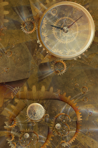
After this, I really should put the gears away for a bit, and try something else for a change. But I couldn't pass up the overlapping stacked-up effect on this one.

Aleph-17 Jewel Movement


The jewels don't show very well on a screen-sized render, but at print resolution they're very shiny and detailed: an excellent example of detail at many scales.

[jewel detail]


Can fractals be steampunk? I suppose they're quite anachronistic, but then so are robots. So they probably can.

Monday, July 28, 2008

Clockwork orange brown

Here's the more complicated image I was working on yesterday. I messed with it a bunch today, as well, and I think maybe now it's done.

Keeping Time

Keeping Time

I'm all pleased with myself, because I've figured out how to make the gear shapes using a single layer of orbit traps, instead of two layers. The teeth used to be one, and the center ring or disc used to be another, but now I've got them all crammed into one unit. This isn't even anything to do with UF5; I could have been doing it in UF3, but until now I hadn't learned how the Multiple Traps thing works. Now I've given it a concerted effort, and I know more than I did. It's somewhat fiddly, but it makes the coloring of the gears a lot easier, and avoids certain annoying discontinuities.

Sunday, July 27, 2008

Manybranchia eyeglassus

This is an odd and rather simple image which was an offshoot of a more complicated thing I spent most of the day working on. It puts me in mind of Edward Lear, not the limericks, but his lovely strange short stories and poems about cats and Clangle-Wangles and the Yonghy-Bonghy-Bo.

The Monocle Tree

Friday, July 25, 2008

Good bones

A little while ago, I had a strange dream in which the Fractal of the Day was gone. I don't know why this was so significant, because I hadn't looked at the FotD in a number of years, but in the dream I was very sad about it. So I went and looked, and there it was, just the same as I remembered. Since then I've been checking it occasionally, and going back through some of the older images. They are soothing in their simplicity: single layer GIFs, no anti-aliasing, and with a certain emphasis on (or at least interest in) mathematical explorations instead of aesthetic ones. At the bottom of each page, there's a set of parameters you can copy and paste into Fractint, if you want to generate the image yourself, for further exploration.

And then I remembered that Ultra Fractal has a fair amount of compatibility with Fractint, so I copied and pasted Elephant Ring. And found myself looking at a rather fascinating unknown formula, almost completely stripped of the smooth slickness I'm used to seeing. To take it even further, I removed the color as well, and had a look at the barest bones of the fractal.

I was reminded that any image starts with the most basic elements of composition: points of focus, lines or curves of emphasis, repetition of shapes, all the stuff that seemed so boring when we were freshmen. But you can't build an effective image without being aware of these underlying structures. This formula has nice ones.

untitled [dividebrot5 skeleton]


Here, the black points are inside the set, and the white points are not. As simple as that.

Pretty soon, though, I was done with minimalism, and started putting layers back on. All the good bits are still there, under the surface, making the finished picture possible. I may have gone a bit too far with lush, multicolored, excessive goop. Maximalism?

Candied Fireball


So, a big thank you to Jim Muth, for the DivideBrot5 formula, and for continuing to produce the Fractal of the Day.

Monday, July 21, 2008

Playing

The cute fuzzy cats go all surreal and melty when you stick them in a fractal.

A Meditation on the Nightmares of Goldfish

I still can't decide whether image importing is just inherently cheesy, or if there might be circumstances in which it would become acceptable. And on the other hand, it's quite easy to make cheesy terrible things without importing any images at all.

8-bit
8-bit

The pre-processing of the cat and fish was done in Photoshop. The video game fractal gives a tip of the hat to Wikipedia for providing me with a screenshot of the original Pac-Man, but all the parts of it were made using various orbit trap colorings, which means I could (in theory) render it enormously large without any loss of image quality. Not that I can think of any reason I'd want to.

Friday, July 18, 2008

Morphology

Hooray, I'm all properly registered now, and messing with the image importing feature. I used a picture of a pretty butterfly, just because I'm in that kind of mood. And because I didn't have a picture of a fluffy kitten handy.

untitled [morpho swarm]


The base for this one is a phoenix formula. The imported butterfly image is quite large, such that I could probably render the fractal big enough to do a decent print. With this remarkable ease of image inclusion, it seems like one major implication is that the possibilities for all sorts of illustration are dauntingly vast. The fractal can become something much more like collage, with enormous potential for surrealism even beyond the already dreamlike quality of the algorithms themselves. The main thing, I suppose, is that now it's very easy to include literal recognizable content. The fractal is no longer a pure abstraction, but can be crammed full of symbolism and allusion and who knows what all.

So beyond knowing about how to assemble the fractal layers into the effect I want, now I need to think about what outside elements to include. It might mean taking photographs, Photoshopping them in various ways, getting them ready for their eventual placement. I could think of it as pre-processing.

I am...intimidated. I thought I didn't know where to start, but now I've started and I don't know which direction to go next.

Saturday, July 12, 2008

New toys

I downloaded the evaluation version of Ultra Fractal 5 a couple of days ago. Man, I really wanted to not like it. I was all set to look at the latest upgrades and improvements, and say "Bah, I don't need any of these flashy new bells and whistles! I tried importing images a couple of times and could never get them to look properly integrated with the rest of the fractal." I was suspicious of the changes to how the coloring algorithms worked. I've been quite happy with UF4, and I could have just kept using it, but of course I was curious, so I thought I'd give the new version a couple of days of testing, to see how bad the learning curve would be.

And then, to my combined dismay and delight, it rocked.

The new separation of, say, general Orbit Traps method and actual trap shape makes the whole thing much more flexible. I love that you can copy and paste just parts of the coloring, to transfer them from one layer to another. I especially love that you can copy and paste attributes to multiple layers at a time; I used to do a lot of exploring where I'd get a number of layers in a good combination, and then decide I wanted to see what that combination looked like on a different Julia set, and have to copy and paste the Julia seed (or even a whole different formula) one layer at a time. It was slow and tedious, and now it's a simple couple of clicks.

I'm still kind of meh about the whole image importing business. The way it works now is really slick, and so I imagine I might spend more time in the future dropping in different images, to see if any of them worked better than my past experiments, but I suspect it's just not my style. My favorite bit of tinkering so far is very silly indeed: I was thinking about the question of importing an image with sufficient resolution to do a large print render, and it occurred to me that extreme low-resolution might be an interesting option instead.

Navigating the Internet


This uses, er, some Barnsley formula or other, with the new and improved orbit traps. The anti-aliasing is generally lousy, because this is a crummy resized screenshot instead of a proper render. I get to agonize now about whether I can manage to afford to register the wretched program and be able to do renders again, or if I should just go back to UF4 for now. Grr, stupid moving expenses. Stupid unexpected car repairs. Maybe next month; I should be a little less broke by then.

Wednesday, July 2, 2008

Purple prose

Bah, I'm ashamed of myself for continuing to read the Complaints Department. Somehow I can never tear myself away for very long. And once in a while it does inspire me to write something silly, so maybe it's not completely terrible.

. . . . . . . . . . .

A fictional conversation, late 1850s.

Woe! Woe! Misery & woe!

What? What's wrong?

A new color has just been invented. It's the first-ever synthetic organic dye.

So, what's wrong with that?

It's mauve! It's an inherently tacky and hideous shade of purple. Now all the talentless amateur hacks will be able to paint pictures with no redeeming artistic value whatsoever. It is the End of the World! Woe!

Wait, are these the same talentless hacks you've been complaining about for the last several years? The ones who are cranking out kitsch at such an alarming rate that your deep and meaningful art never has a chance of getting any critical notice?

Yeah, those same ones.

So why is having a new color any different than using the same old colors?

Because now the hacks have it EASIER! Instead of having to use a paintbrush to make their horrible travesties, they can just dunk the canvas straight into dye, and call it done!

Huh. Well, okay, I guess. But why does it matter so much what the hobbyists are doing? It seems to bring them some joy, and it's not like it needs to affect your important, well-thought-out art in any significant way, does it?

What! Of course it affects my art! You see, they're calling their appalling junk art, so how in the world can anyone be expected to tell the difference? I mean, they're both called the same thing, and there's so much of their bad art out there that most people are going to think that's what it's supposed to be like. Then when people see my good art, they think it's stupid and wrong. Oh my, people say such terrible things about my art. They tell me it's ugly. They say it looks like it was made by a talentless amateur hack. Woe!

Wow, that really sucks. Have these art-defying amateurs always made bad kitsch, even though you've been carefully pointing out what's wrong with it all these years?

Yeah, there's no stopping them. They don't seem to listen to me at all.

And yet you keep trying.

Well, I feel it's important. Somebody has to speak up about these things. Silence implies agreement, after all. It's a public duty, at the very least, for a few brave, clear-sighted individuals to bring these injustices to light.

So you continue to repeat, over and over again, that their aesthetic sense is non-existent, their efforts are inadequate and laughable, their standards are faulty, and their respected institutions are riddled with corruption, is that it?

That's pretty much it, yes.

But somehow, none of them seem to like you very much.

No.

I just don't understand it at all.

They're just wrong, that's all. Misguided and wrong.

Well, that's all the time we have. Thanks for chatting. Goodnight!

Woe!

Armageddon in Mauve


(The preceding image was constructed without the use of false devices. Persons claiming to be our representatives are swindlers. No soap 'til Thursday.)